UX/UI
CPHFW

Copenhagen Fashion Week – Infoscreen & Mobile App
Role: UX & Visual Designer
Team: Designers, coders, and creative thinkers
Responsibilities: User research, persona development, flows, wireframes, design system, usability testing
The Challenge
Copenhagen Fashion Week is one of the largest events in Denmark, but visitors struggled with:
Scattered event information
Difficulty navigating between venues
Lack of practical planning tools
Our mission: create a digital solution that makes the event more navigable, inclusive, and personally relevant.
The Solution
We designed a two-part experience:
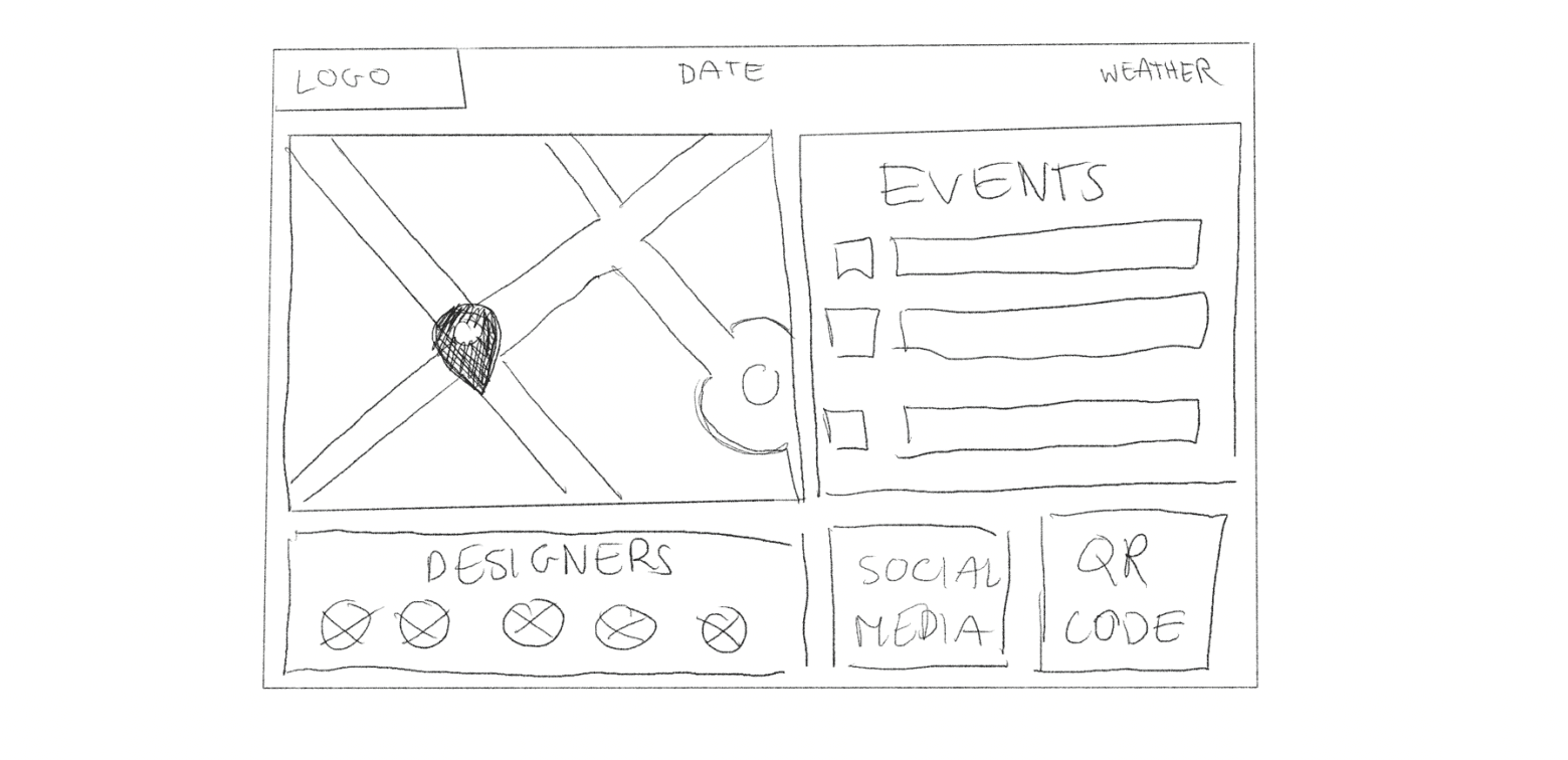
Infoscreen → A high-contrast, public display providing instant access to essential event info (schedule, map, designers).
Mobile App → A personalized digital companion with scheduling, navigation, and designer profiles.
Together, these solutions met diverse user needs—quick updates in public spaces and deeper engagement on mobile.
My Contributions
User Research
Conducted interviews, desk research, and observations in crowded areas
User Segmentation & Persona
Defined three user groups and created Emma Nielsen, 23, eco-conscious fashion student
Ideation
Used How Might We questions, affinity mapping, and Value Proposition Canvas to generate and refine ideas
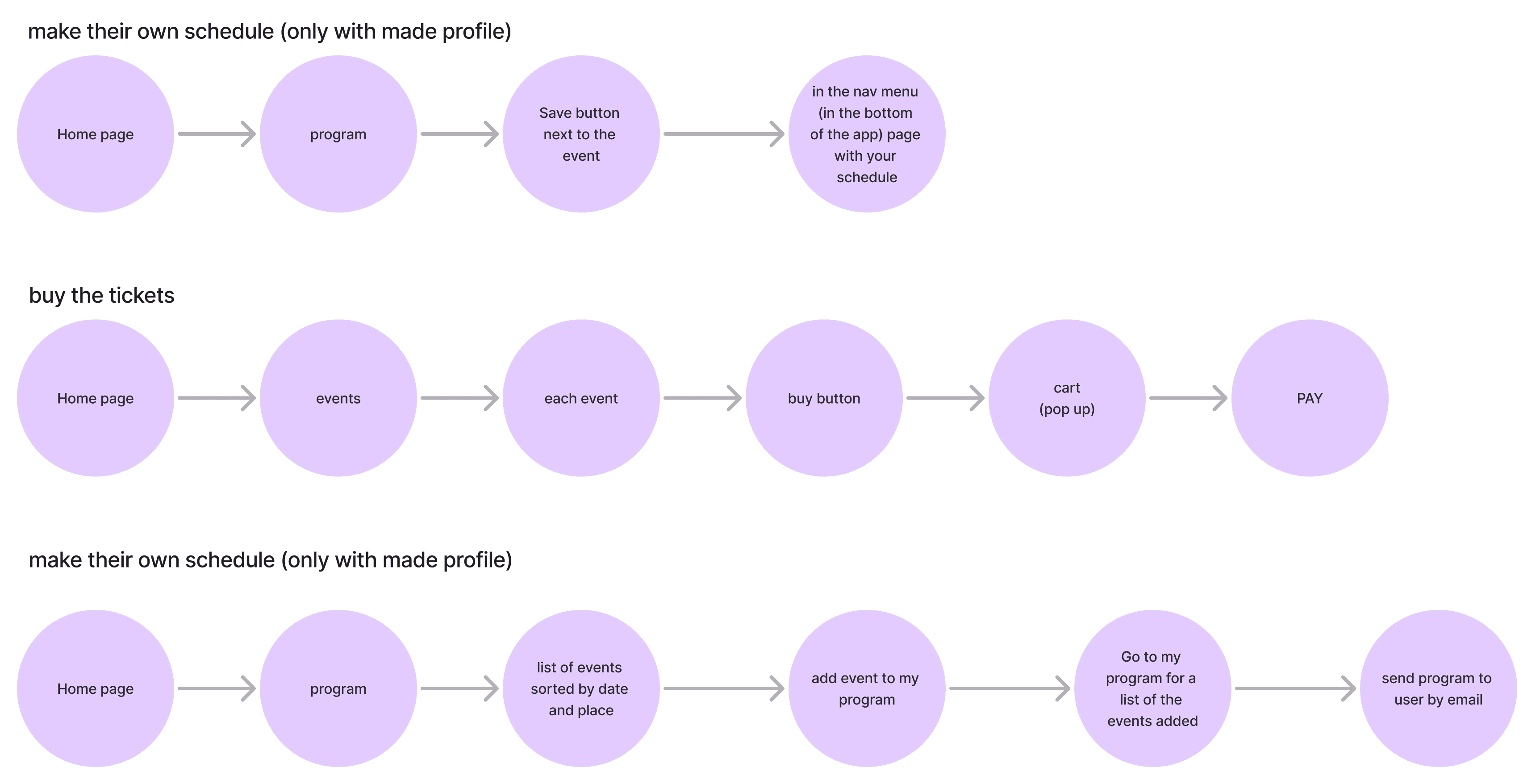
User Flows & Wireframes
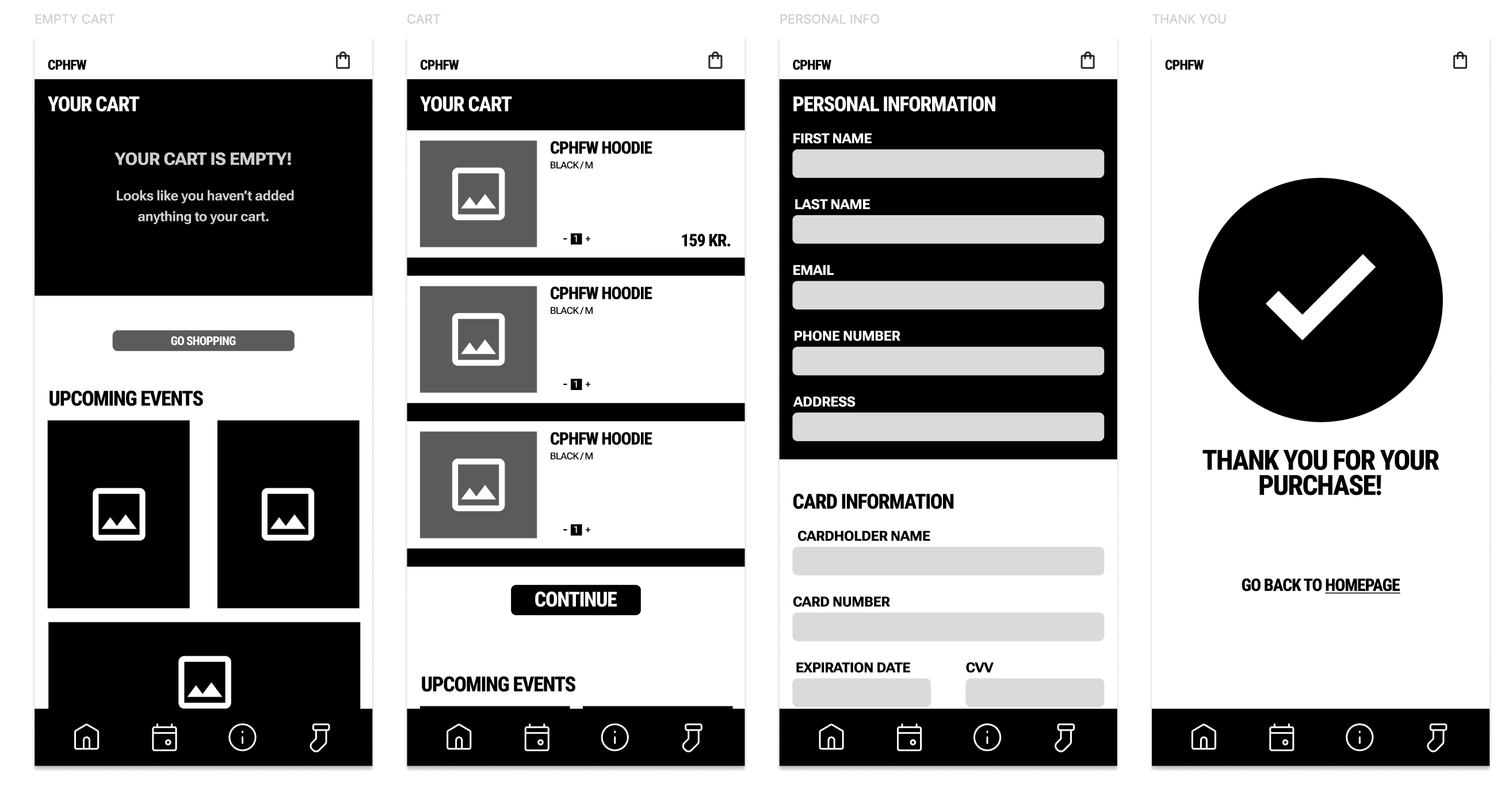
Designed task flows for scheduling, navigation, and ticketing → tested with lo-fi sketches
Design System
Established typography (Roboto), minimalist color palette, and Gestalt-based layouts to ensure visual coherence across app & Infoscreen

Usability Testing
Ran think-aloud sessions on lo-fi and hi-fi prototypes → iterated based on issues (e.g., relocating map, adding toilets & parking)
Key Features
Infoscreen
Designers Page – highlight fashion creators
Events Page – showcase schedules & must-see shows
Map Page – quick venue navigation
App & Social Links – connect on-site visitors to deeper digital tools
Value: Provided fast, low-barrier access to critical event information.


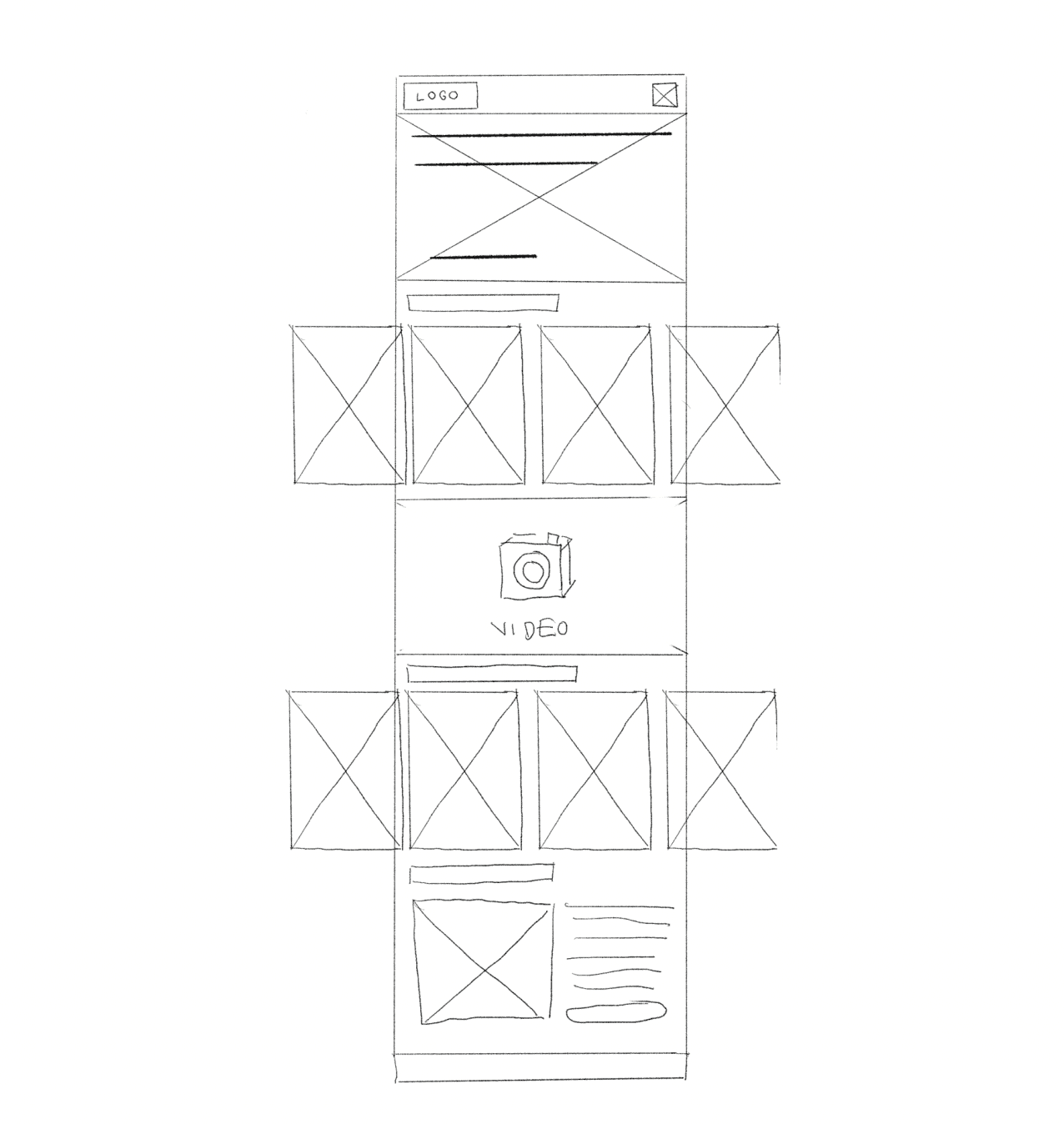
Mobile App
Roboto typography for legibility & fashion alignment
Minimal black/grey/orange palette (60-30-10 rule)
Intuitive layouts based on Gestalt principles
Interactive scheduling, maps with icons, designer profiles
Value: Empowered visitors to plan, personalize, and immerse in the fashion week.

Outcome & Impact
Delivered a coded Infoscreen prototype and mobile app prototype
Addressed key pain points: fragmented info, poor navigation, limited personalization
Feedback from usability tests confirmed increased clarity and usability after iterations
Strengthened CPHFW’s identity with a cohesive design system across solutions
Reflection & Next Steps
This project taught me how to design for both public displays and mobile companions within one ecosystem.
Next steps could include:
Testing the prototypes live at a fashion event
Expanding the app with sustainability-focused features (e.g., eco-brand highlights)
Adding accessibility tools (language options, larger text mode)